![[Design System] SaaS 產品設計系統建置|Turing Certs](/images/design-system/cover.webp)
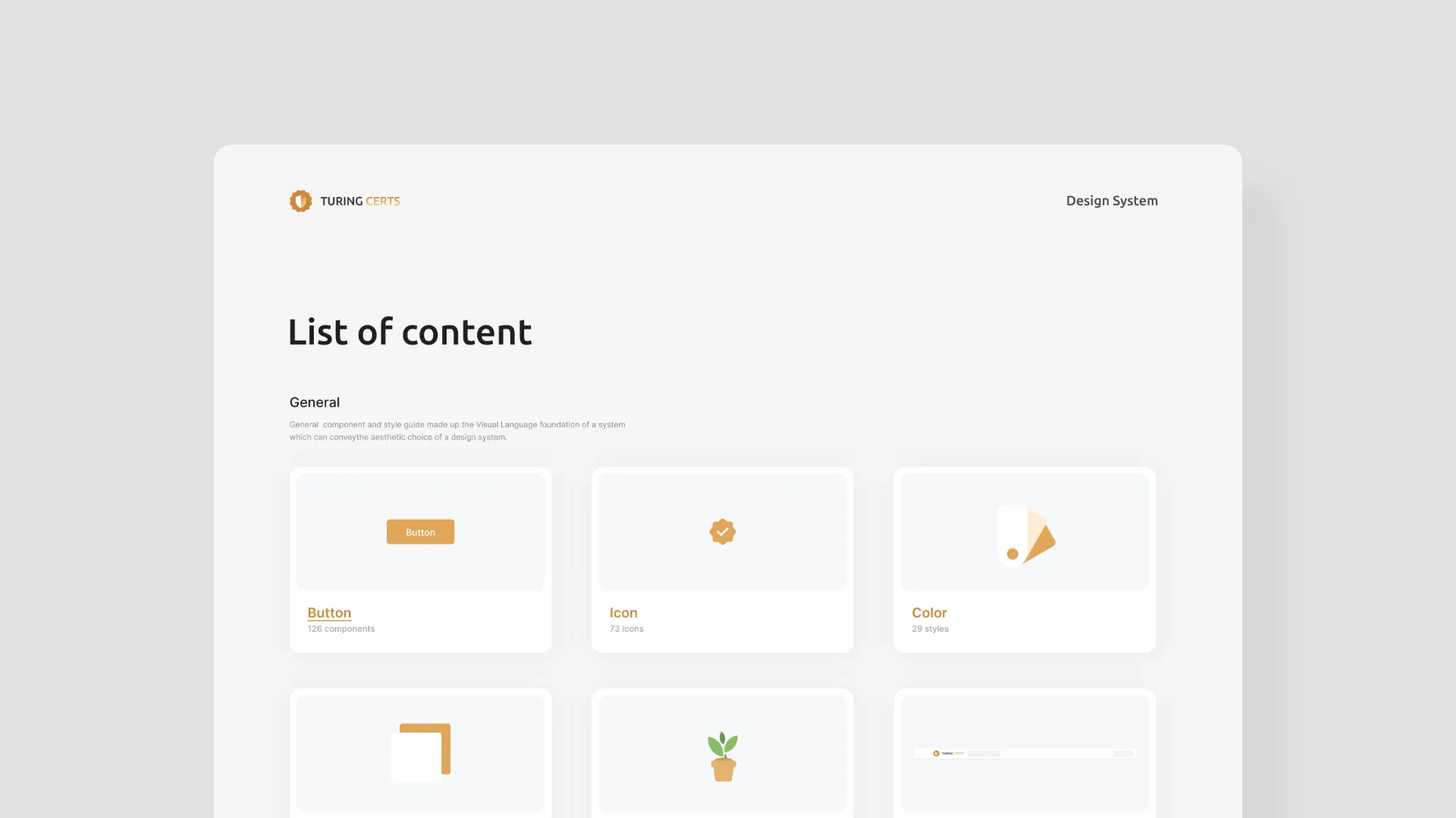
Design System — Turing Certs SaaS Platform
As Turing Space scaled rapidly, design debt accumulated across the product. I audited existing components and rebuilt a unified design system — covering foundational tokens, reusable components, and a shared Figma library — to reduce friction between design and development.
Impact
- 盤點並統一產品中重複的元件與規範
- 建立色彩、字體層級與圖示的基礎系統
- 用 Auto Layout 與 Variants 打造可複用元件與組件庫
- 顯著縮短設計時間並提升產品體驗一致性
Built a product design system for Turing Space to improve design and development efficiency.
As Turing Space's product features and pages expanded rapidly, we faced a pressing challenge: without a unified component inventory and design standards, the product had accumulated a significant amount of duplicate and inconsistent design elements. This directly resulted in:
- Designers spending a large amount of time searching through numerous pages to find the correct, up-to-date components
- Old and new component versions coexisting simultaneously, causing team members to frequently misuse them and creating inconsistent user experiences
- These issues slowing down the design and delivery speed of new features
To address this growing "design debt," I initiated the construction of a product design system.
2026 Update
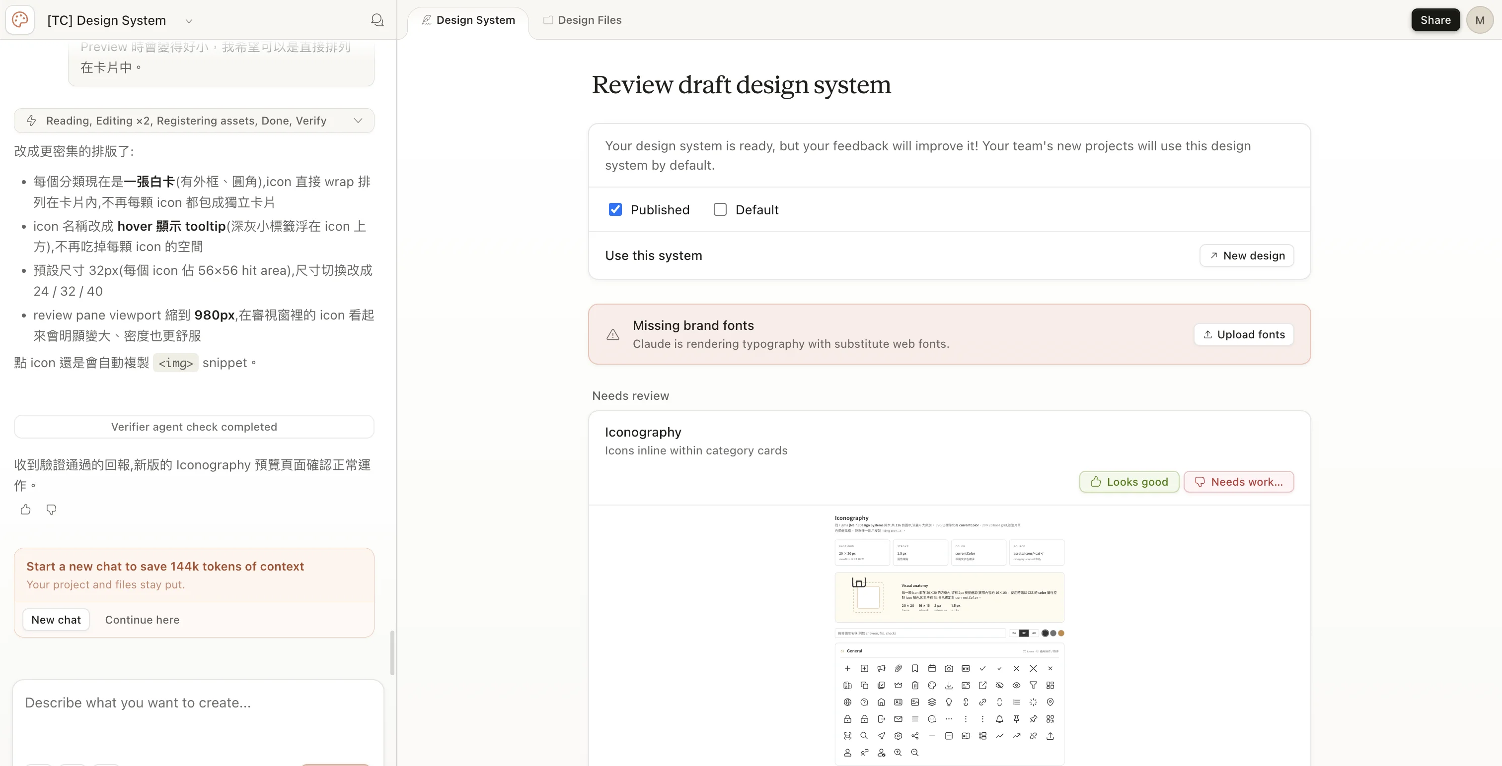
Recently, in response to the company's adoption of AI development workflows, the design team also established a Design System on Claude Design.
A developer-friendly Design.md & Design Guideline was created to make it easy for different team members to apply.
1. Comprehensive Audit & Unification
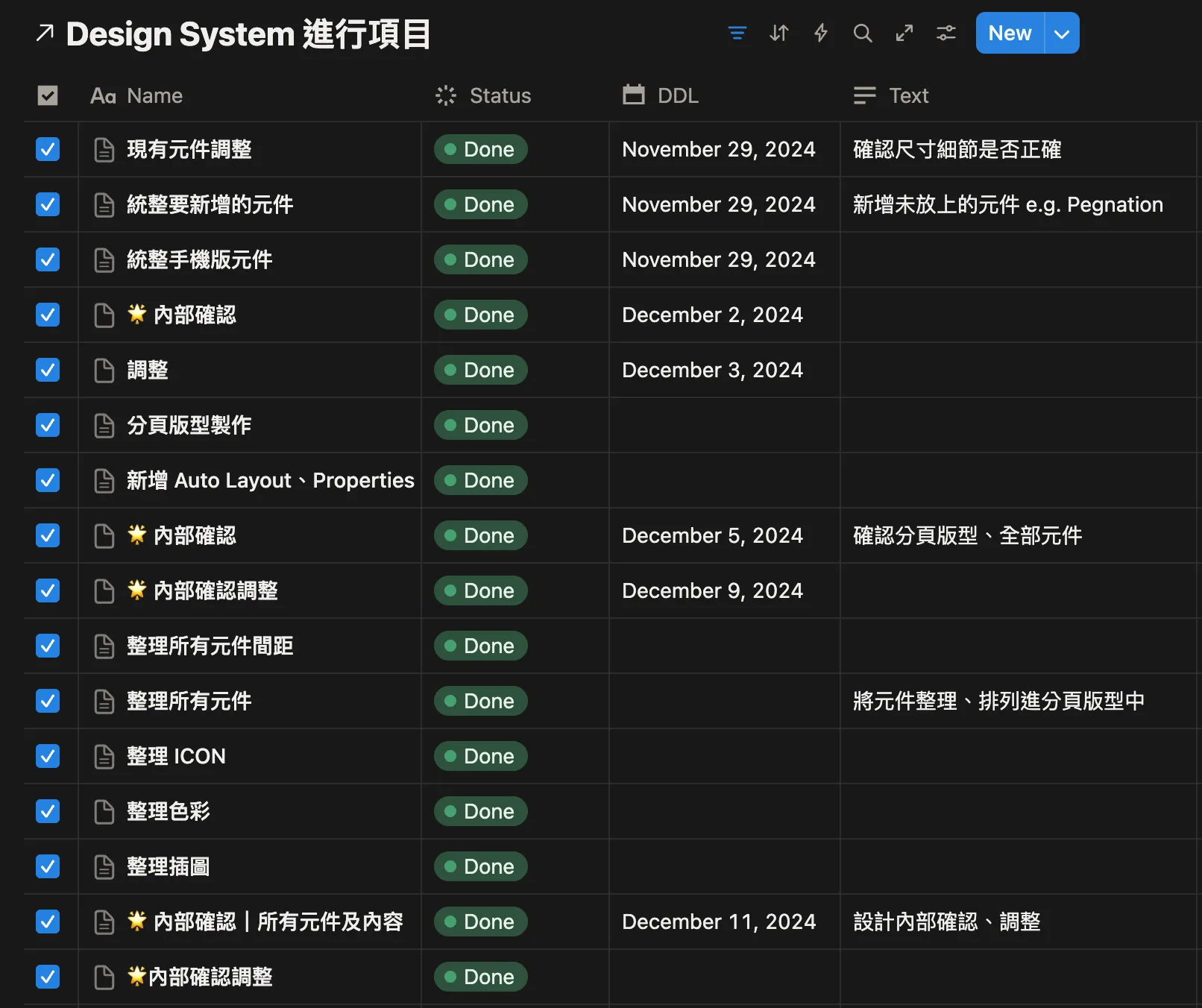
The first step of the project was to conduct a full audit of all existing UI components in the product. I categorized and organized all duplicate components (such as Buttons and Date Pickers), and worked with the team to define unified design standards.
2. Visual Foundation
Building on the audit, I established a clear set of foundational guidelines, including a unified color system, typography hierarchy, and icon library, ensuring that all future designs maintain visual consistency.
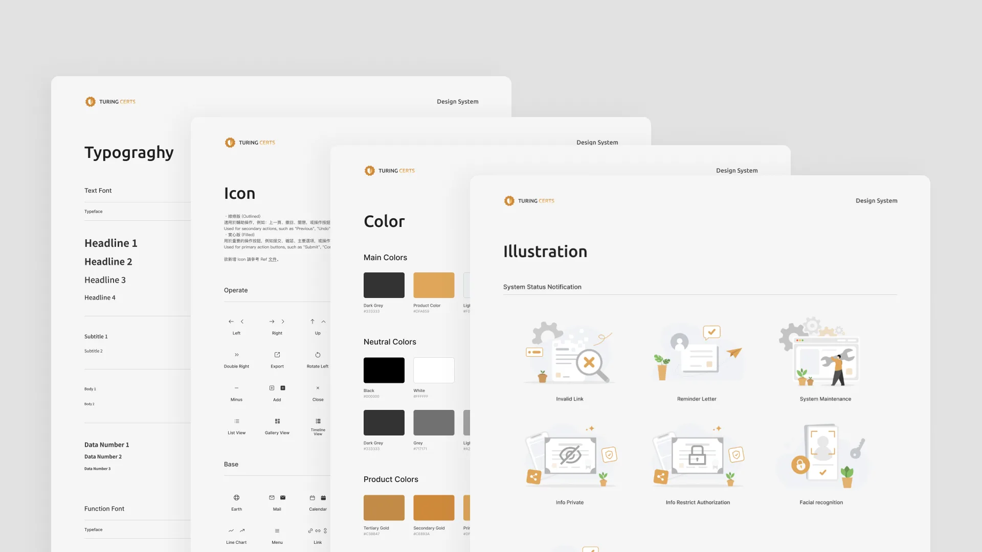
3. Modular Component Library
I rebuilt all unified base components — such as Buttons and Switches — into a reusable component library using Figma's Auto Layout and Variants. Each component has complete states and clear naming conventions, allowing designers to intuitively search for and apply them.
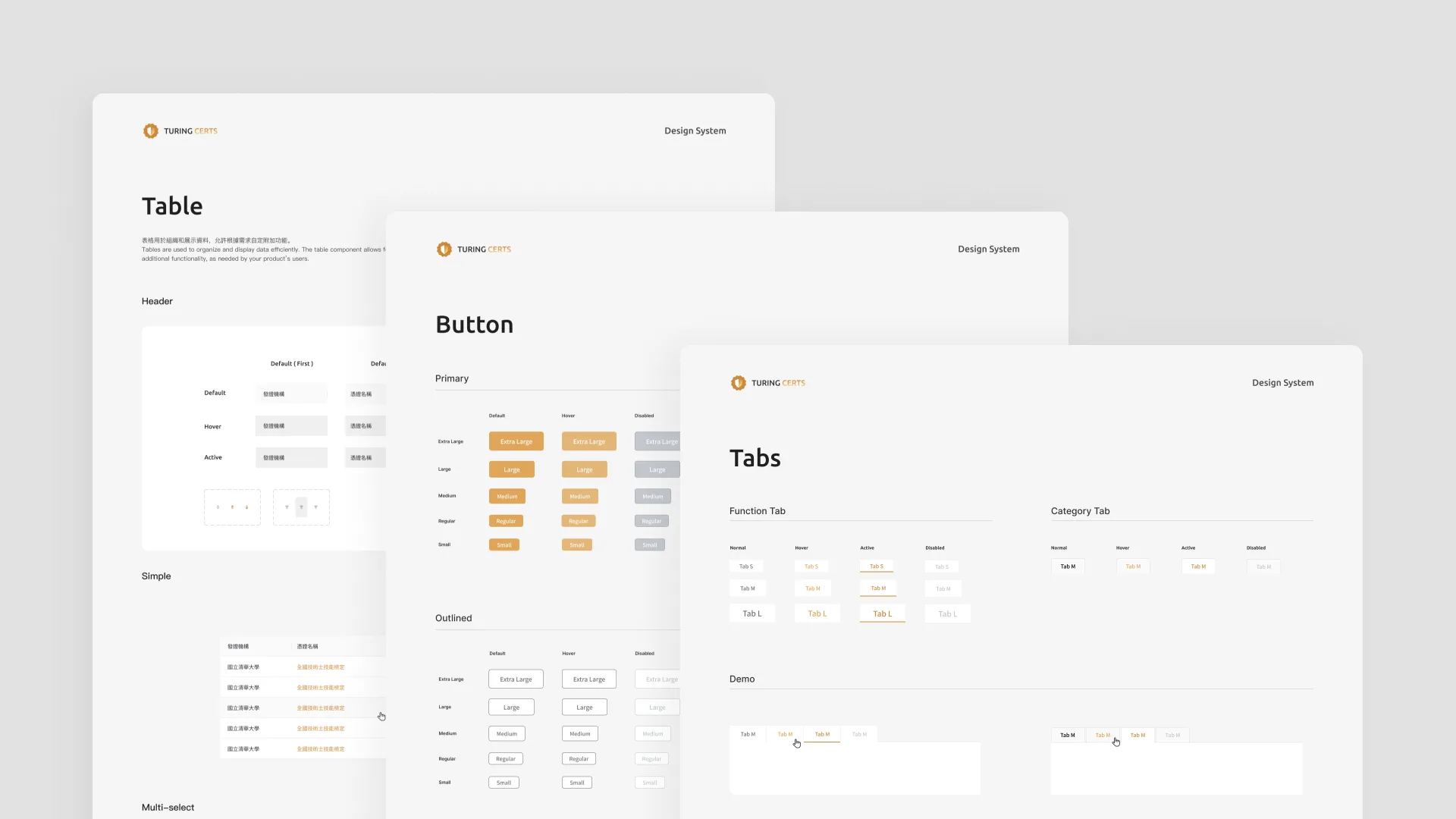
4. Composite Component Library
Finally, I combined multiple "components" to construct more complex "compositions." In particular, given the frequent need for Popups in our product, I built a series of quickly applicable modules, significantly improving design efficiency for related features.
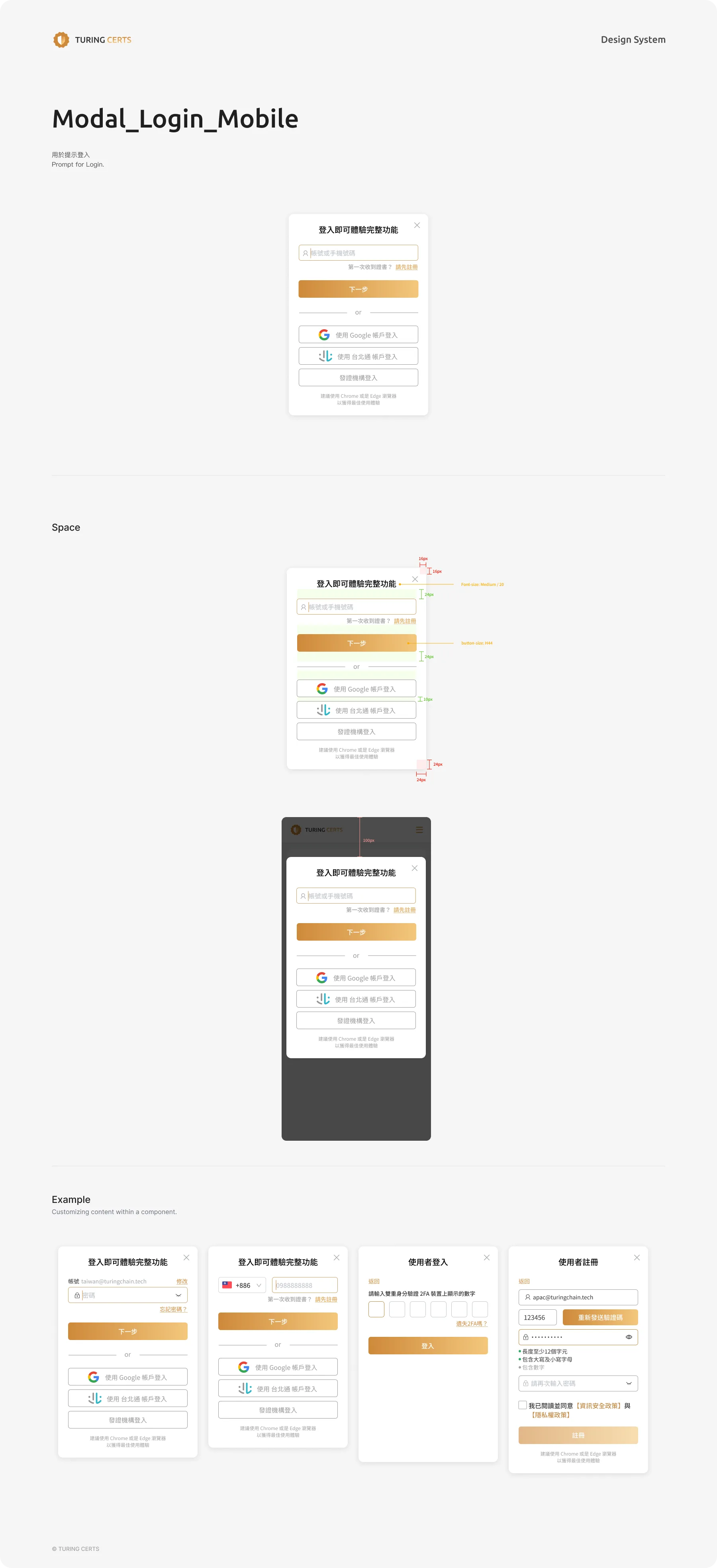
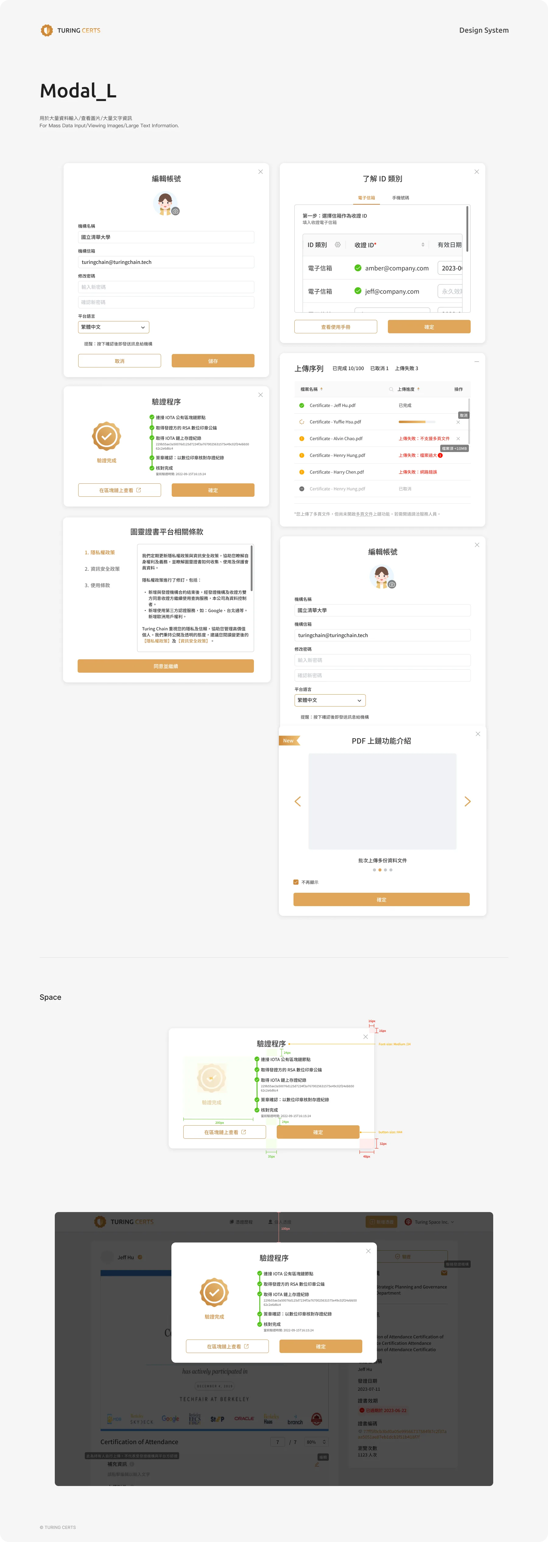
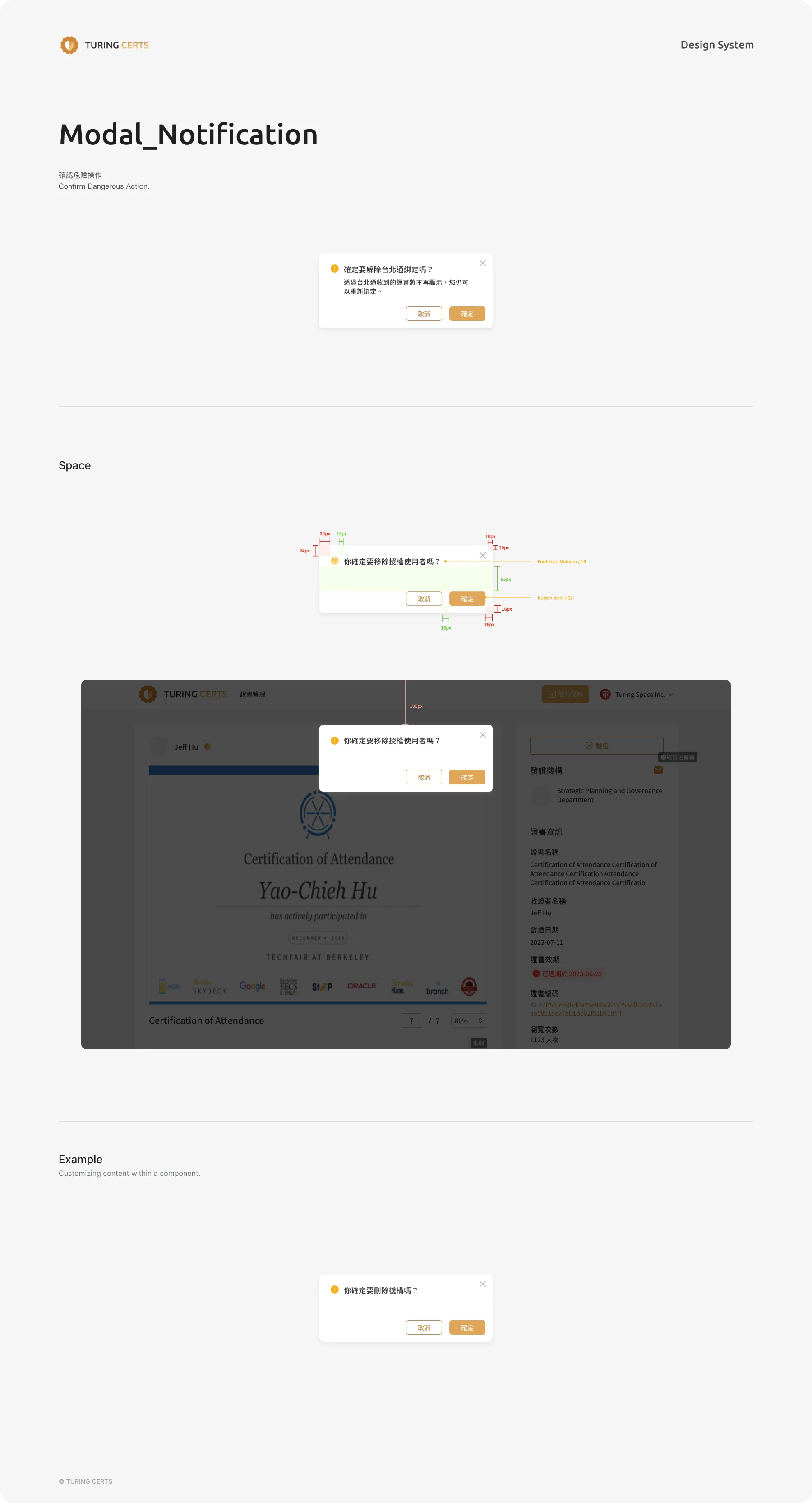
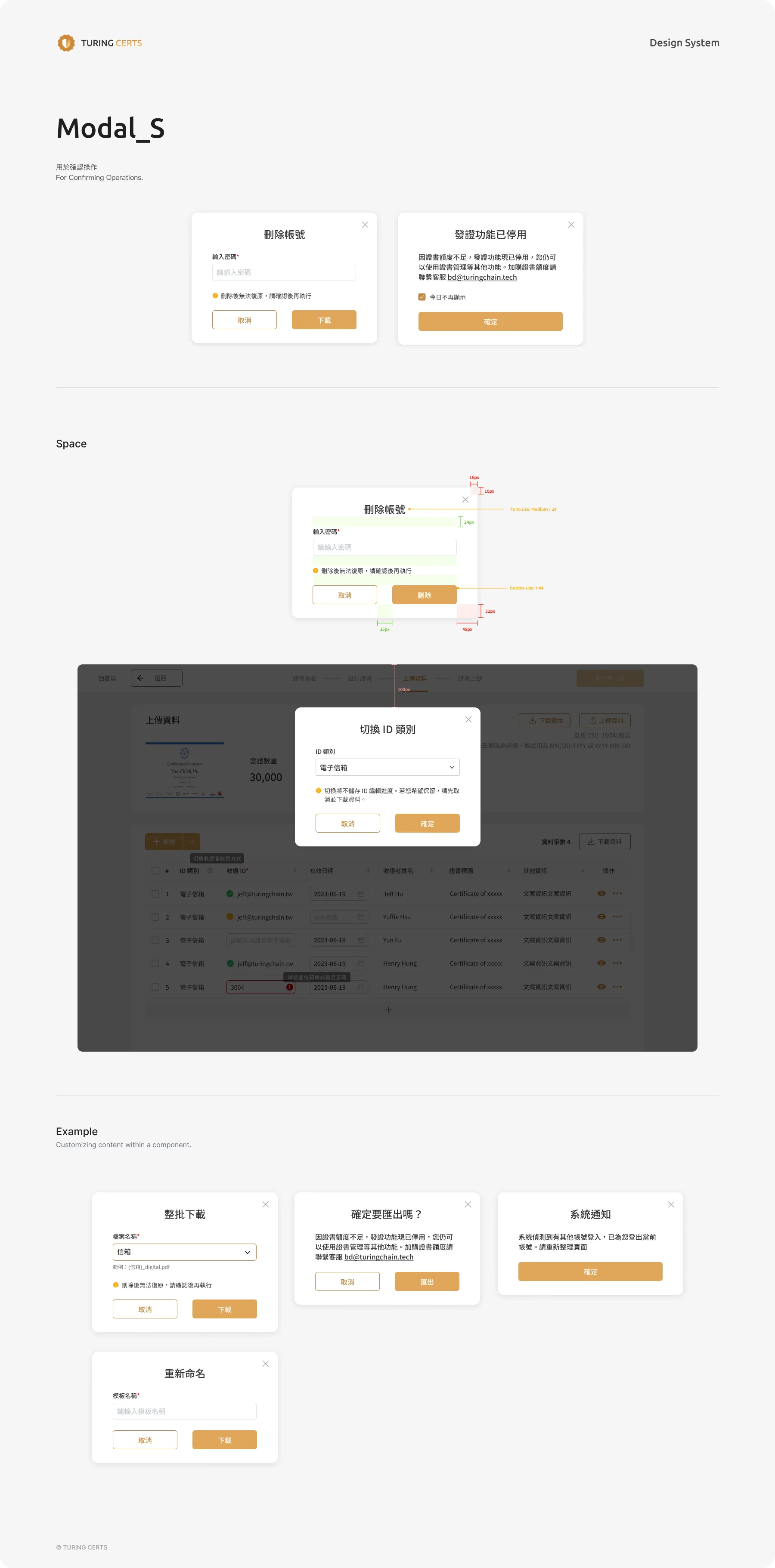
Outcomes & Impact
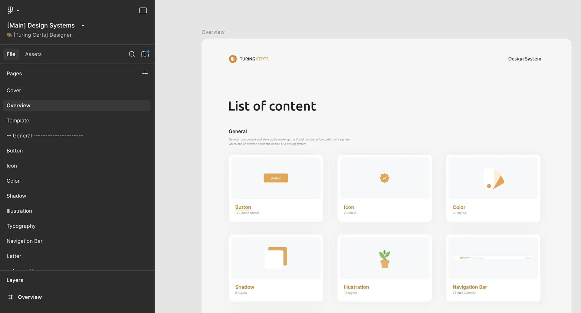
Click below to view the full design system ⬇️
- Design Efficiency Improvement:
- Designers no longer need to search endlessly for components, and version misuse has been fundamentally eliminated, significantly reducing the time needed to design new features
- Product Experience Consistency:
- Unified components and standards ensure a consistent visual and interaction experience across the entire product, strengthening user trust
- Team Collaboration:
- The design system has become a shared design language for the team, reducing communication overhead and enabling new members to onboard into the development workflow more quickly
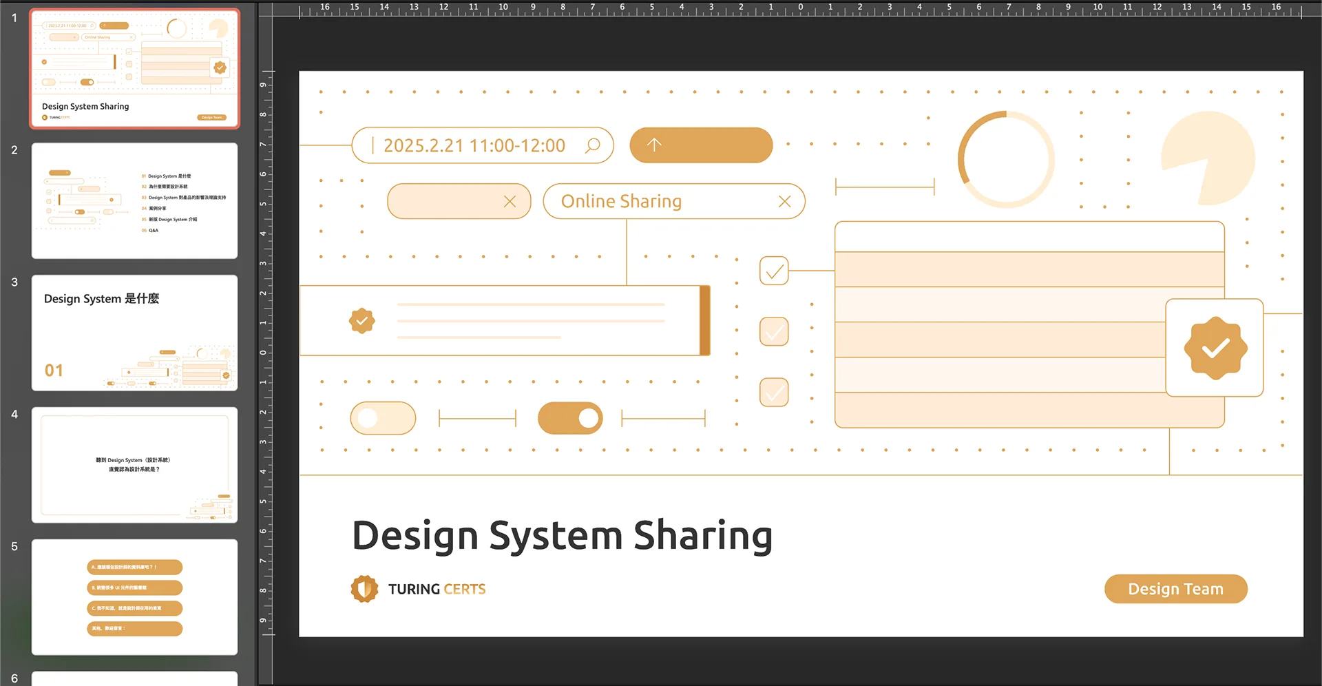
Additionally, I organized a Design System sharing session. Beyond the product team, colleagues from all departments attended, allowing every member of the company to understand what a design system is and why it matters.
![[AI Builder] Self-Serve by Design — TCS Website & Dashboard](/images/tcs-dashboard/cover.gif)