![[UI/UX] 以儀表板讓客戶看見產品創造的價值|Turing Certs](/images/cc-dashboard/hero.webp)
Making Value Visible — Turing Certs Dashboard
The issuer back-office of Turing Certs originally surfaced only scattered data, making it difficult to assess certification performance. I redesigned the homepage information architecture, transforming the back-office into a KPI-centered monitoring dashboard so that design decisions directly address the operational questions clients care about most, increasing overall product value.
Impact
- Defined KPI hierarchy from customer interviews and survey results.
- Separated monitoring and management tasks into clearer dashboard levels.
- Helped B2B clients understand issuing performance through trend and contribution views.
- Shifted the homepage from passive data lookup to active performance monitoring.
Background
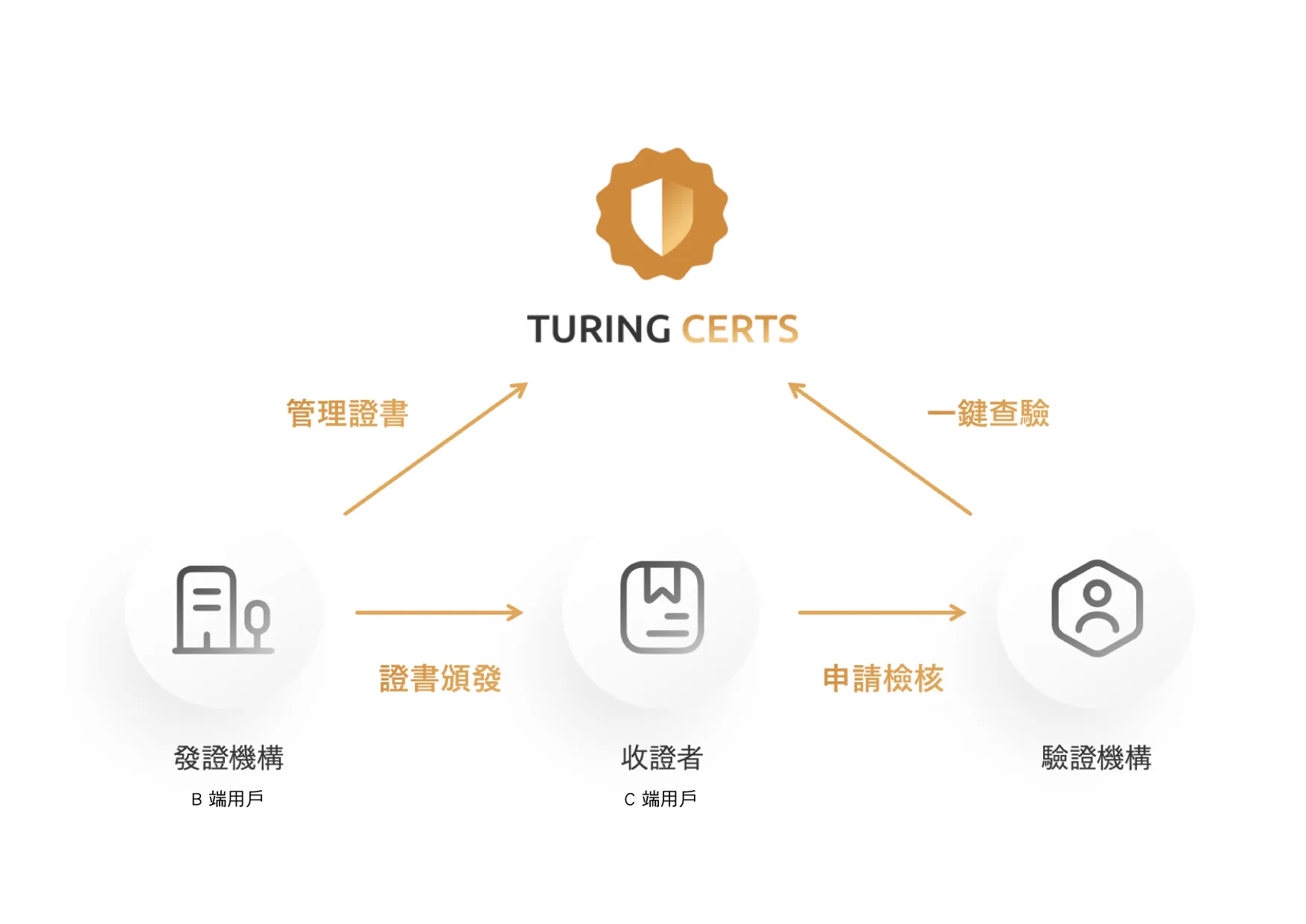
Turing Certs is a blockchain-based digital credential platform that connects issuers (enterprises / schools / institutions) with recipients (individual users).
Issuers use the platform to issue tamper-proof, verifiable digital credentials to their users.
However, the original issuer dashboard only provided a handful of basic data points (total issuance count and a detail list), leaving issuing organizations unable to:
- Get a comprehensive view of issuance and claim status and trends
- Evaluate the effectiveness of their credential programs
- Leverage data for decision-making
From a business perspective, this was also a retention problem: a dashboard that demonstrates no visible value offers no incentive for customers to renew.
The goal of this redesign was therefore: to increase dashboard dwell time and product stickiness through meaningful data insights.
Challenges
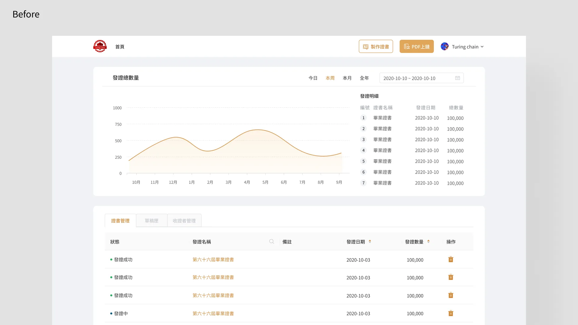
The biggest problem with the old homepage was that it mixed two distinct user tasks on the same page, and the data it showed was of no value to customers:
- Data monitoring and list management were combined on a single page
- For issuing organizations, the total issuance count and a long list of issuance records on the homepage served no clear purpose and were not intuitive to read
The real challenge therefore had two layers:
1. What to show? What data do issuing organizations actually care about? What helps them evaluate effectiveness and make decisions?
1. How to show it? How do you organize data so it is immediately comprehensible — shifting customers from passive viewing to active insight — rather than overwhelming them with numbers?
Design Strategy and Key Decisions
Before Design: Using Research to Define "Which Metrics to Show"
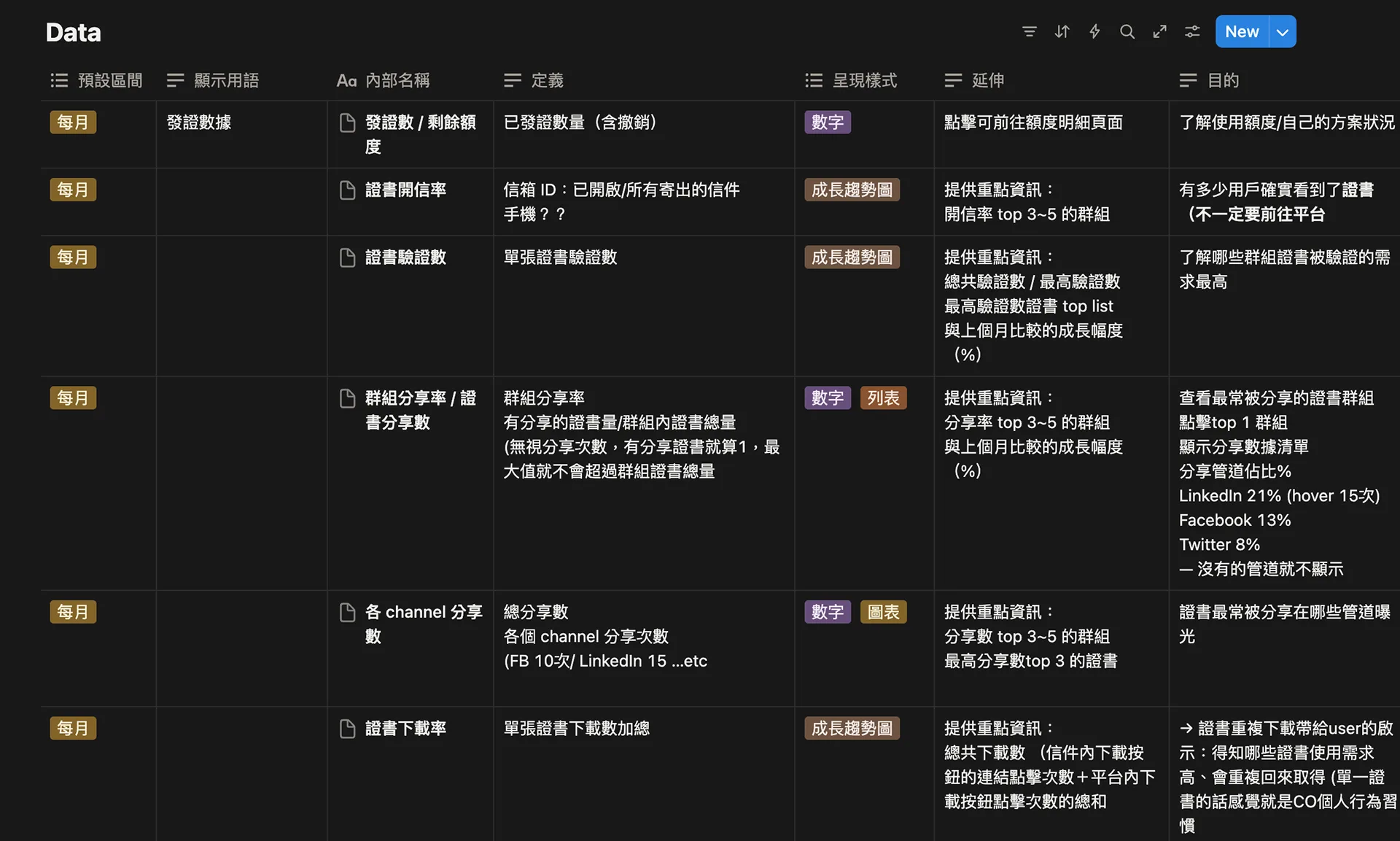
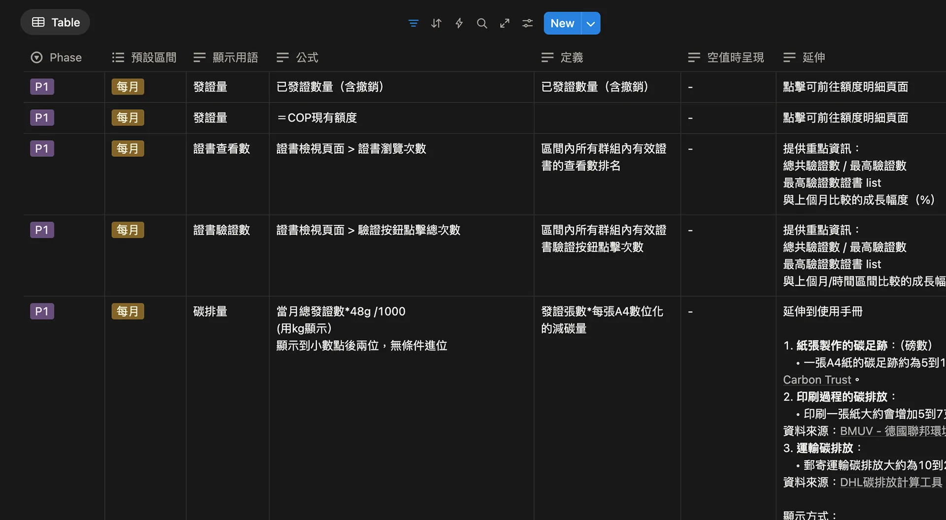

Before touching the UI, I worked with the PM to plan a research study to confirm that the dashboard would surface data customers actually care about:
- Interviews with key customers: Targeting customers in the top tier by 2024 issuance volume, top tier by total historical issuance, and those recommended by the BD team (with complimentary credits as a participation incentive) — to understand their issuance context, the numbers they care about, and what they typically look for after credentials are sent
- Survey: Responses collected from approximately 24 organizations, directly asking "which credential data would you most want to see in the dashboard" and "which new features would you most like to have"
Research findings:
> Most customers felt the current dashboard data had no value and they never checked it
>
> The most-requested data points were credential view count, claim rate, recipient profile, carbon offset equivalent, and social share count
This research gave our decisions an evidence-based foundation rather than relying on intuition.
A. Redefining Page Hierarchy and Enabling Role-Based Navigation
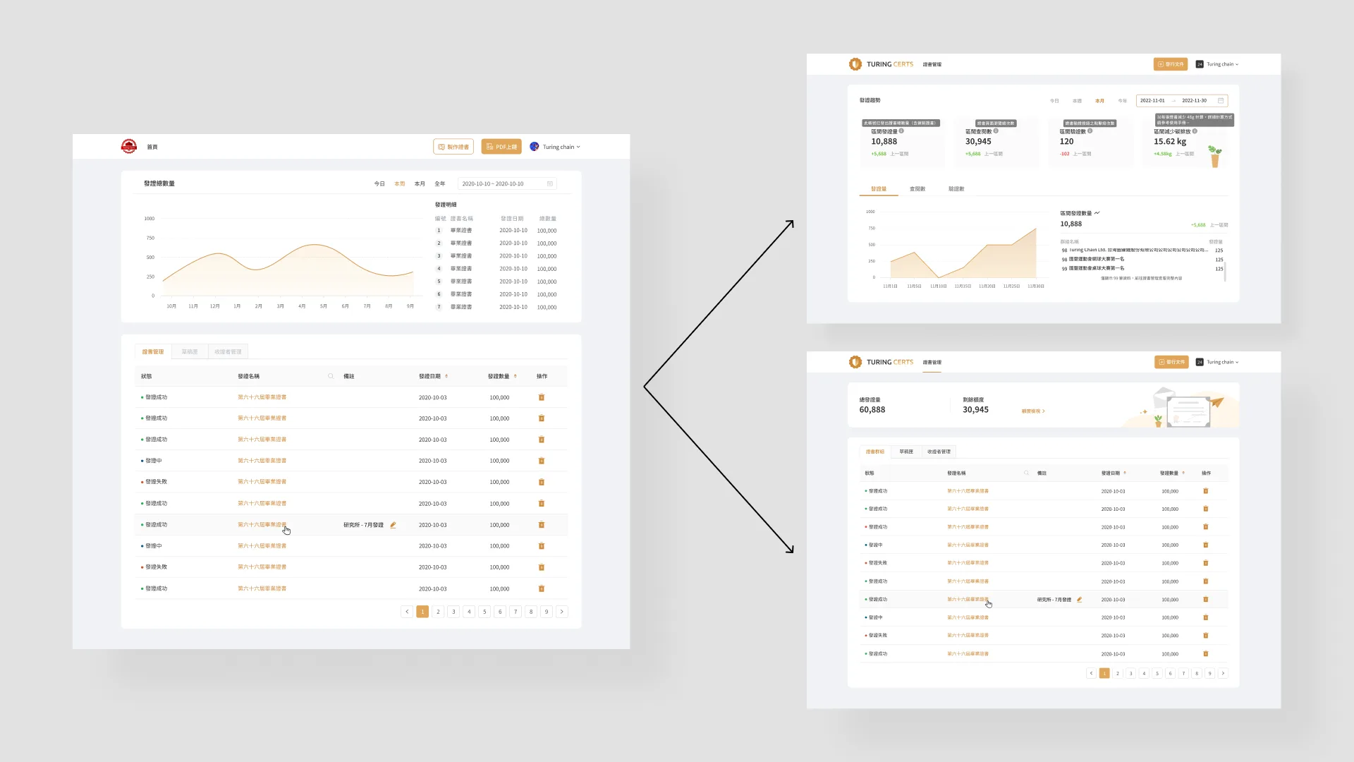
My first step was to redefine the information hierarchy of the pages.
The old version mixed "data" and "management" tasks together. A customer noted:
> We currently have two roles using the dashboard — senior staff who focus on data, and frontline operators who handle issuance tasks
I therefore wanted to split the functionality into two tiers:
- First tier (Homepage): Positioned as a "Monitoring Dashboard" for viewing data
- Second tier (Inner page): Positioned as a "Certificate Management Center" for operations (retaining the original certificate group management table and remaining quota, and directing users here after issuance to check progress)
The homepage becomes solely responsible for status overview; the inner page solely for operations — separating information and tasks while also enabling role-based navigation.
B. Building a KPI-Centric Dashboard Homepage
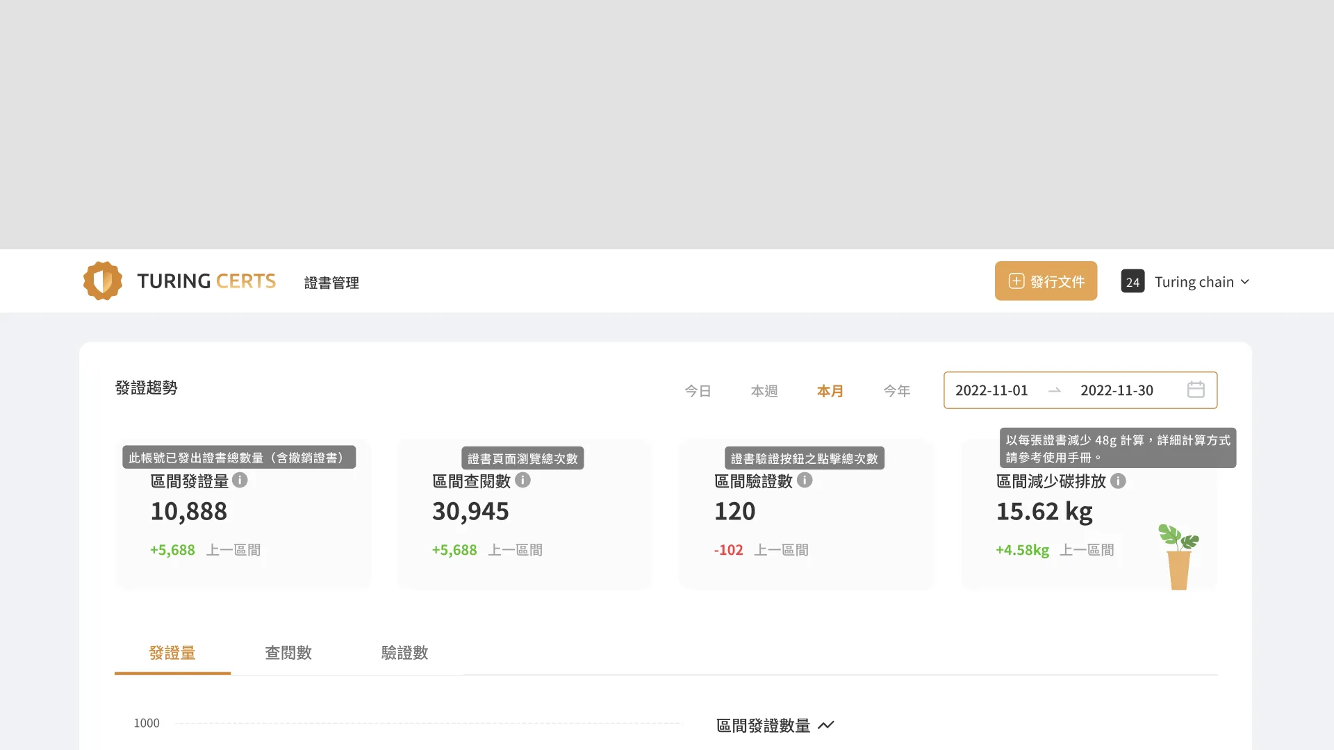
I dedicated the most valuable page real estate to the metrics users care about most: issuance volume, credential views, credential verifications, and carbon emissions reduced.
I minimized descriptive copy to keep the overall layout clean and uncluttered, retaining only information customers can absorb within 3 seconds.
The intent is for users to immediately grasp the most important operational metrics upon entering the page — shifting behavior from passive lookup to active insight.
It also creates an opportunity for the dashboard data to help users better appreciate the value the product delivers.
C. Optimizing Chart and Data Linkage to Improve Analytical Efficiency
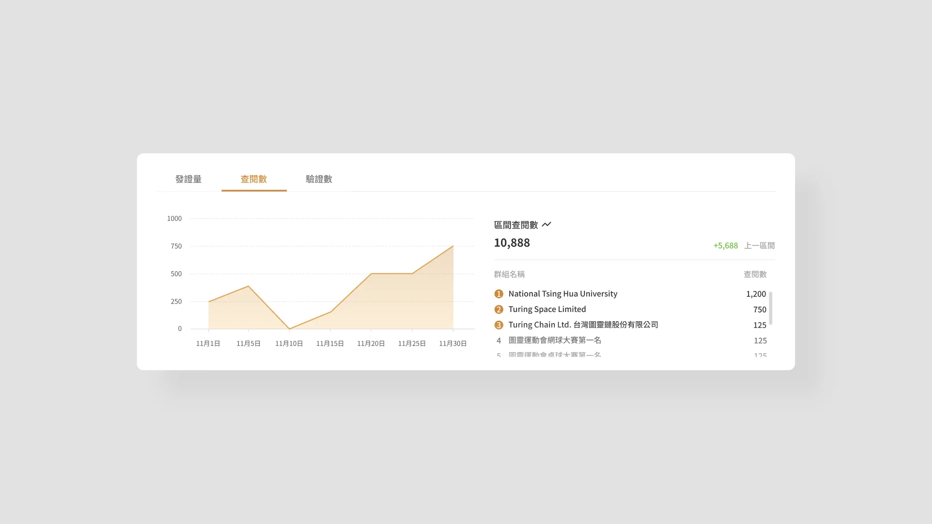
I redesigned the relationship between charts and data lists, placing the "Issuance Trend Chart" alongside the "Contribution Ranking List" (group ranking).
Users can view overall trends while simultaneously seeing each issuance group's contribution — the two panels complement each other and significantly improve data readability.
Design Tradeoffs
- Stage 1 focuses on core trendable metrics (issuance volume, view count, verification count, carbon emissions)
- High-demand items from the research that require deeper analysis — claim rate details, recipient profiles, and data export — are deferred to Stage 2, ensuring v1 ships as a complete, polished experience as quickly as possible
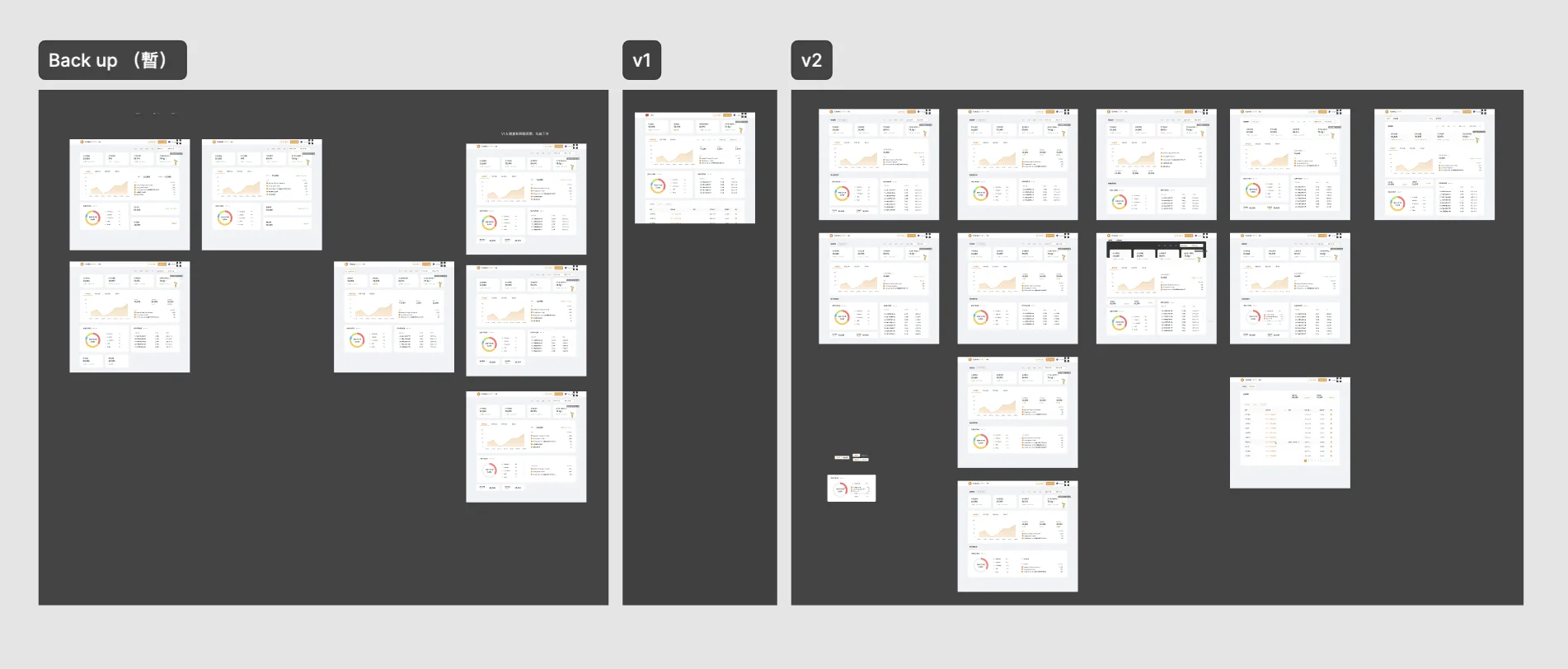
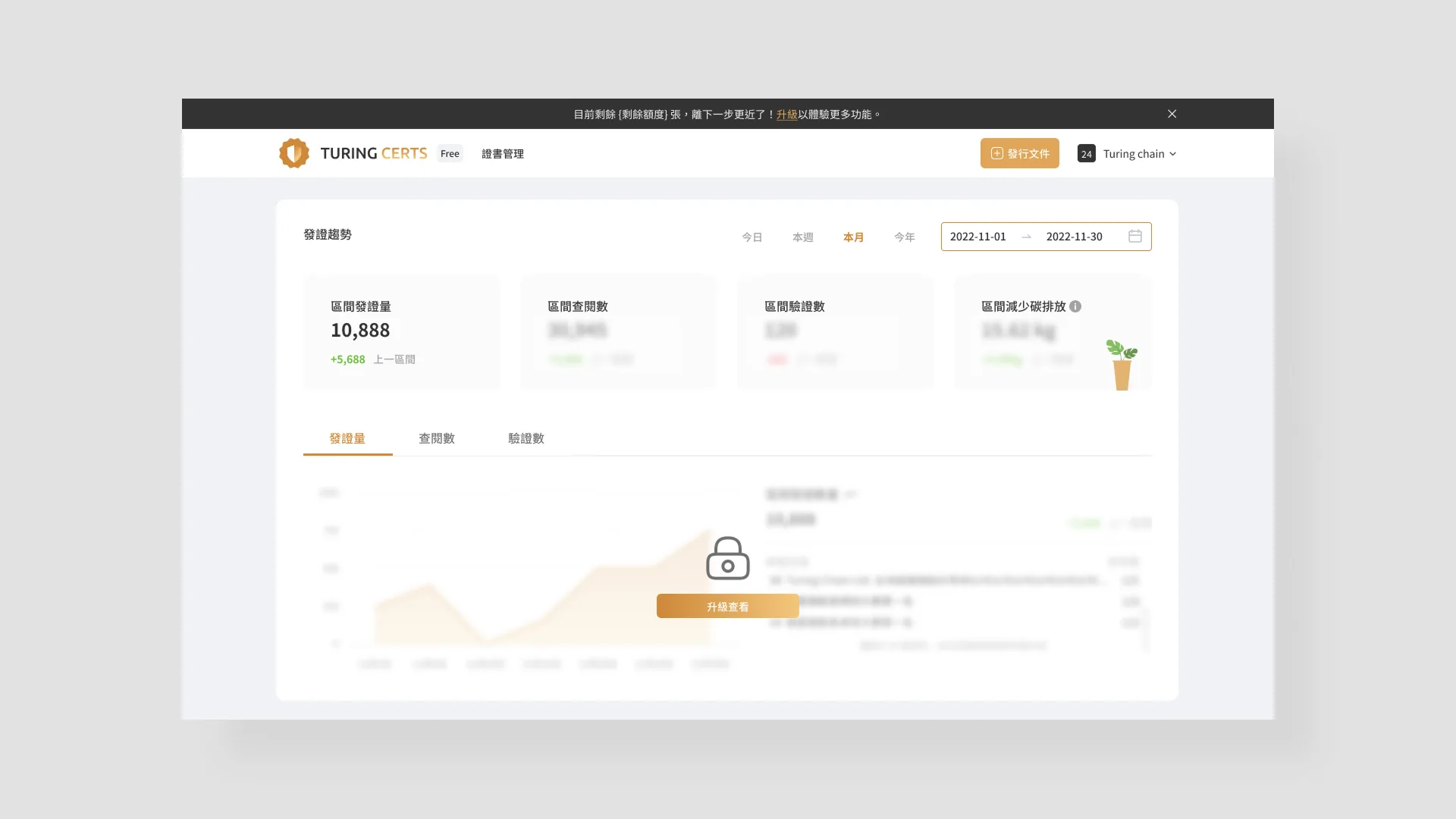
- Designed in alignment with the business model
- In anticipation of a later Free Plan launch, the dashboard incorporated tiered thinking around Basic / Premium plans, so that free-tier users would be motivated to subscribe upon seeing the depth of insights available
Outcomes and Reflections
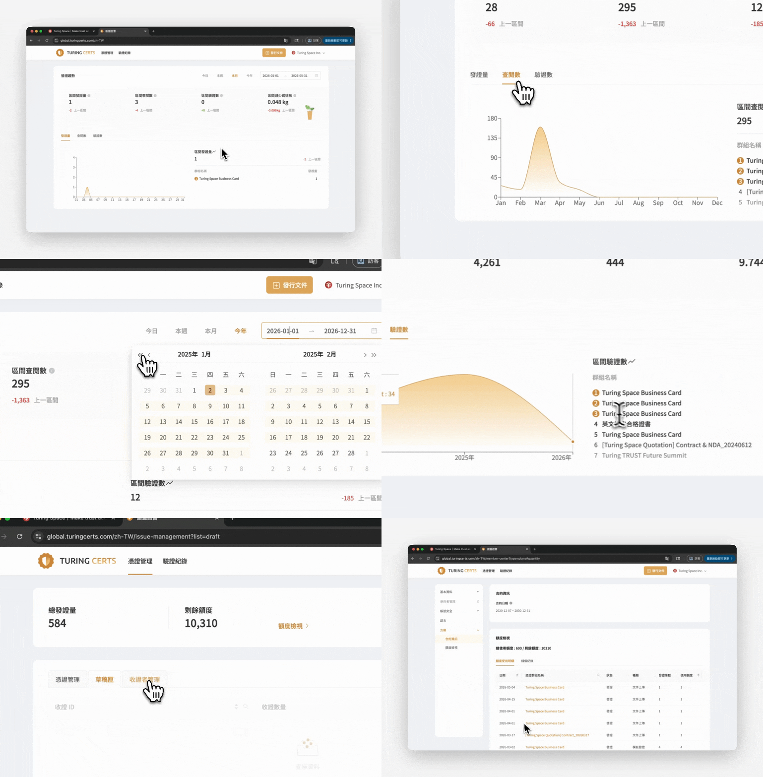
1. We implemented GA event tracking on the dashboard; post-launch analysis showed customer dwell time on the page increased by 50%
1. We also conducted post-redesign interviews, and the majority of customers felt the redesign made a significant positive difference
1. The "carbon emissions" data in particular proved especially useful, as customers could incorporate it into ESG corporate reports and similar deliverables
![[AI Builder] Self-Serve by Design — TCS Website & Dashboard](/images/tcs-dashboard/cover.gif)