![[品牌整合] 國際組織品牌與網站|APDI](/images/apdi/cover.webp)
Brand & Website — APDI International
APDI is a newly established Asia-Pacific digital identity international consortium. I built its brand identity system, official website, and offline event applications from the ground up, enabling the organization to communicate externally with a consistent and professional image. The project encompasses logo design, CIS, a Webflow website, white paper, business cards, and event visuals — and was shortlisted for the 2025 GOOD DESIGN AWARD.
Impact
- Built the brand identity system from 0 to 1.
- Designed official website, business cards, white paper, and event applications.
- Created a consistent visual system across digital and physical touchpoints.
- Nominated for 2025 GOOD DESIGN AWARD.
From zero to one — building a complete professional identity for the APDI international organization, from Corporate Identity System (CIS) to official website
This work was shortlisted for the 2025 GOOD DESIGN AWARD
Background
The Asia-Pacific Digital Identity (APDI) consortium is an international organization newly established in 2024, dedicated to promoting digital identity authentication cooperation across the Asia-Pacific region.
As a brand-new organization, APDI initially lacked a unified, professional public-facing image, making it difficult to effectively communicate authority and credibility on the international stage.
My challenge was to build a comprehensive brand visual system for APDI and apply it across all digital and physical touchpoints, ensuring a high degree of consistency and professionalism throughout the brand identity.
Corporate Identity System (CIS) Development
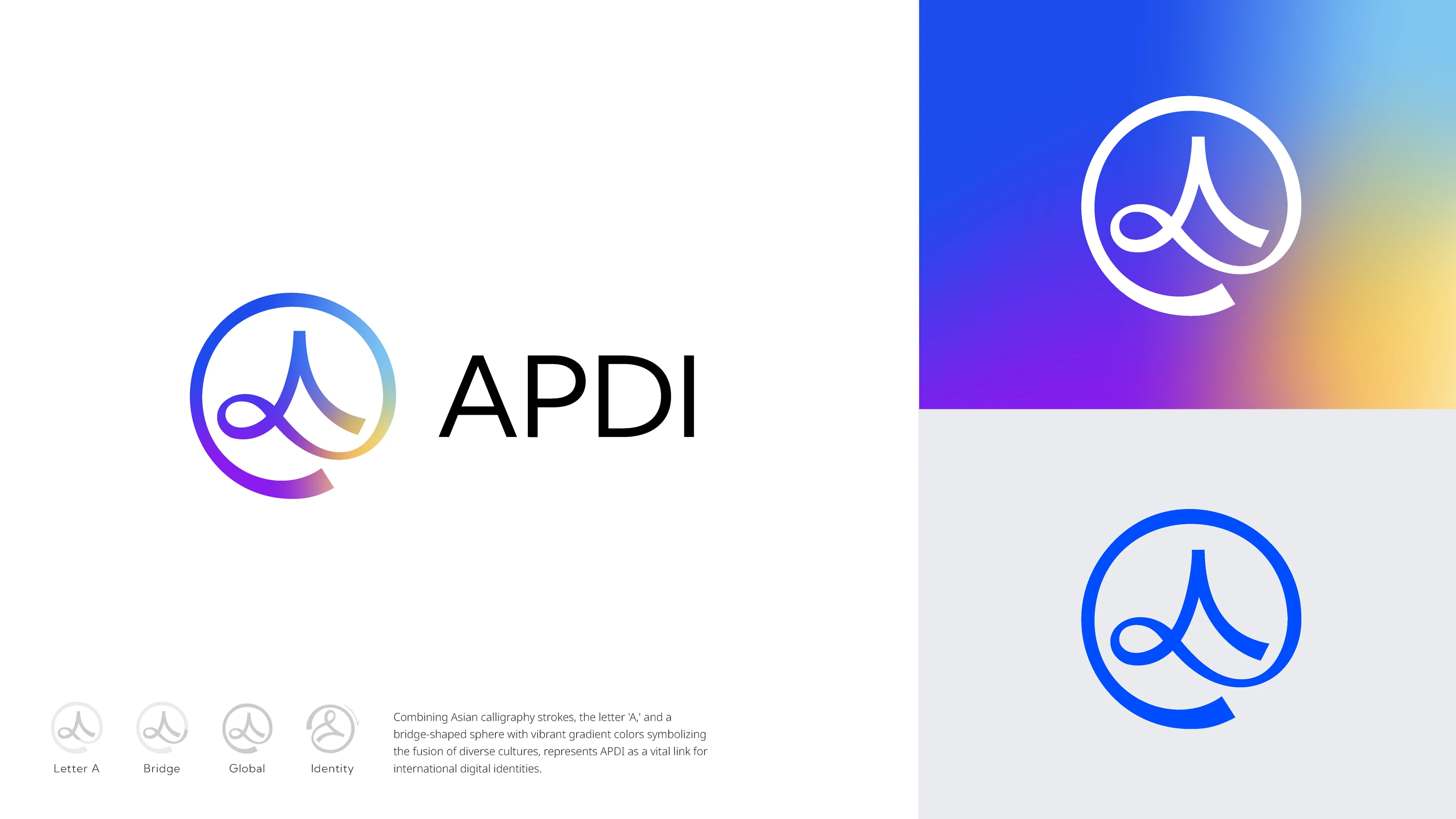
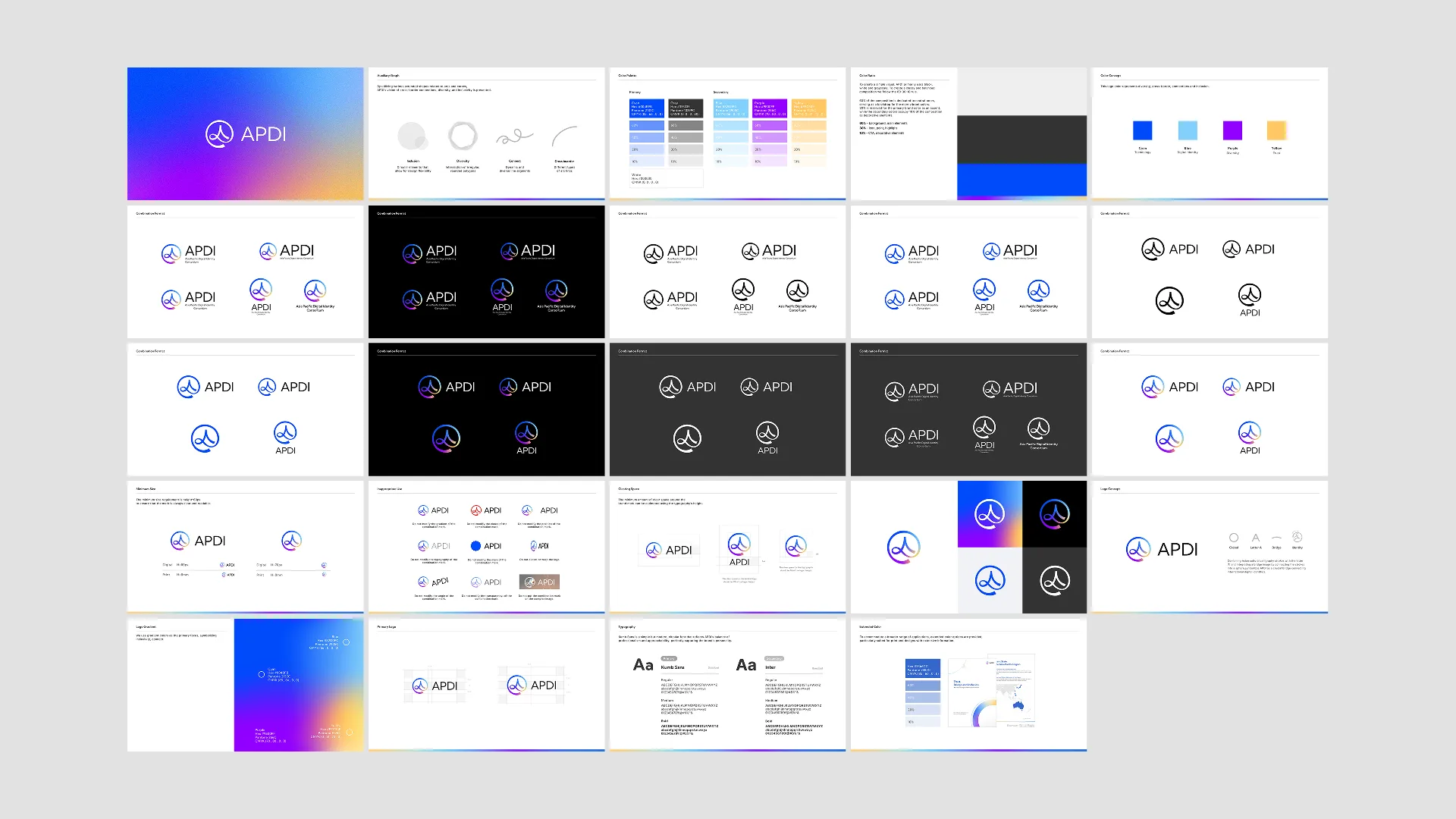
The first step of the project was to translate the organization's core values — "connection," "professionalism," and "trust" — into a concrete visual language.
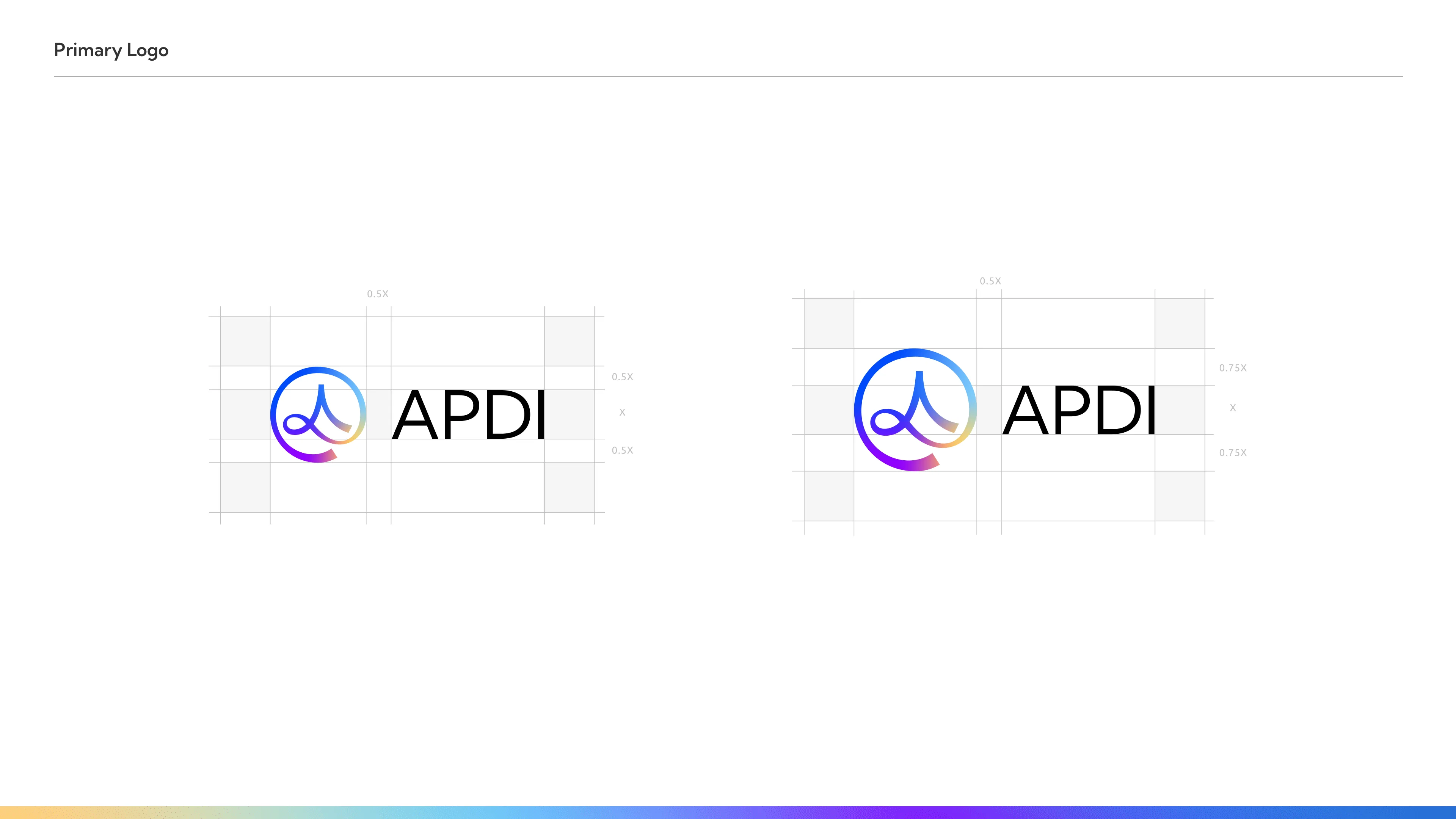
I designed a new logo, defined a professional color palette and typography system, and compiled everything into a comprehensive CIS guidelines manual to serve as the unified standard for all future design work.
> Combining Asian cultural calligraphy strokes with the letter 'A' and integrating a bridge image by connecting the strokes into a sphere, symbolizes APDI as a crucial bridge connecting international digital identities.
>
> We use gradient colors as the primary focus, symbolizing inclusivity, connect.
Official Website | Visual Design & Development
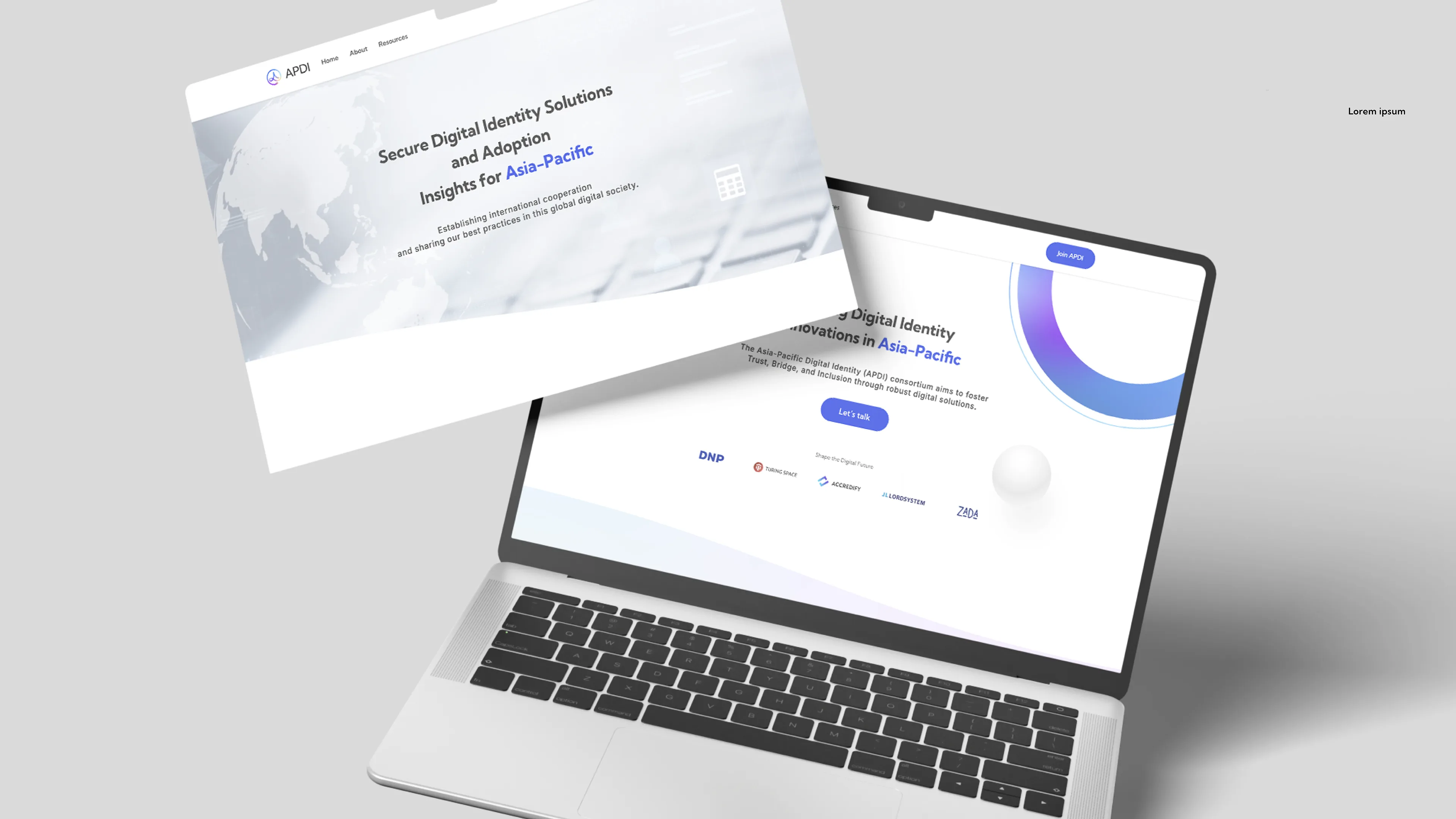
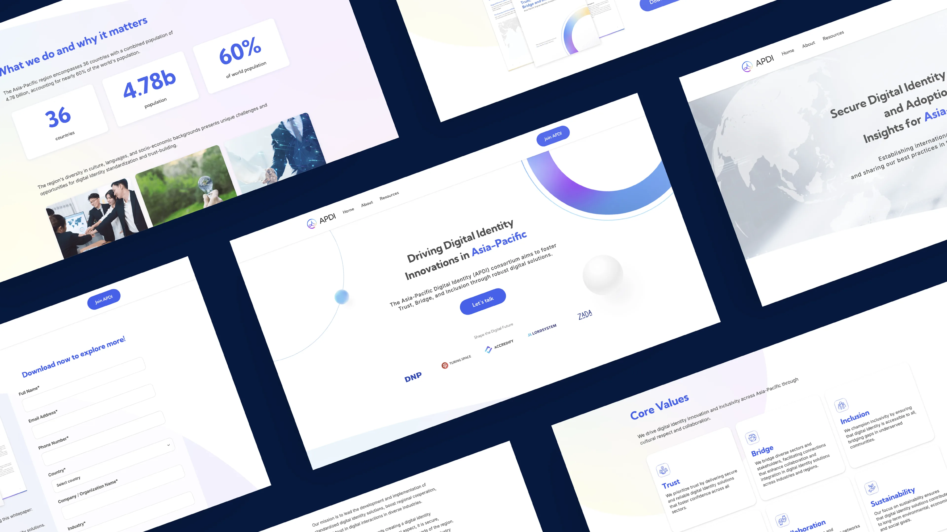
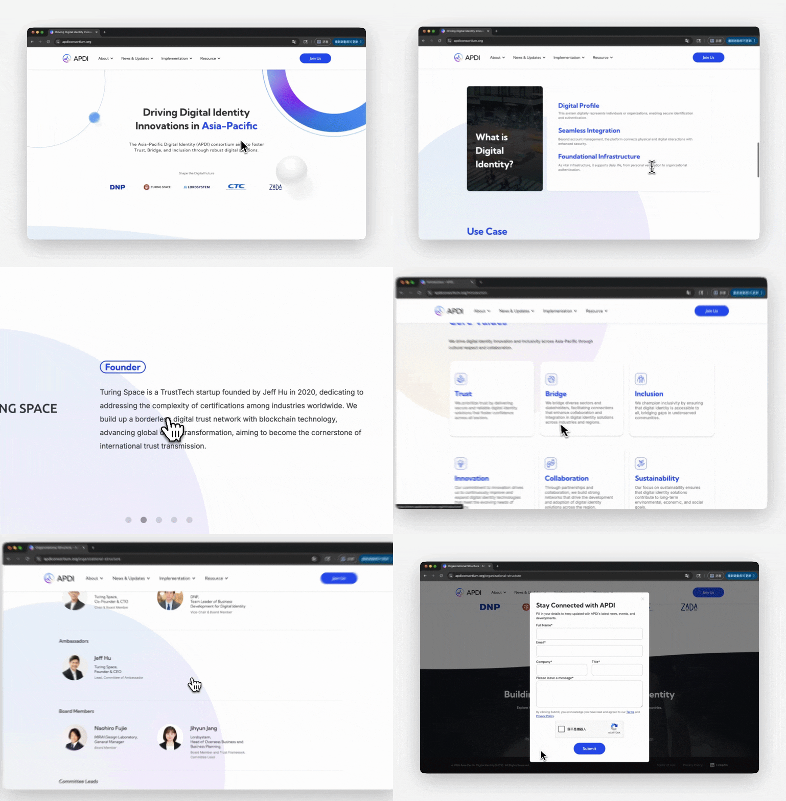
The official website is APDI's primary digital presence. I independently handled the entire process — from information architecture and UI design to full production build using Webflow.
The design focus was on clear information communication and a seamless browsing experience, with consistent presentation across both desktop and mobile devices.
https://www.apdiconsortium.org/
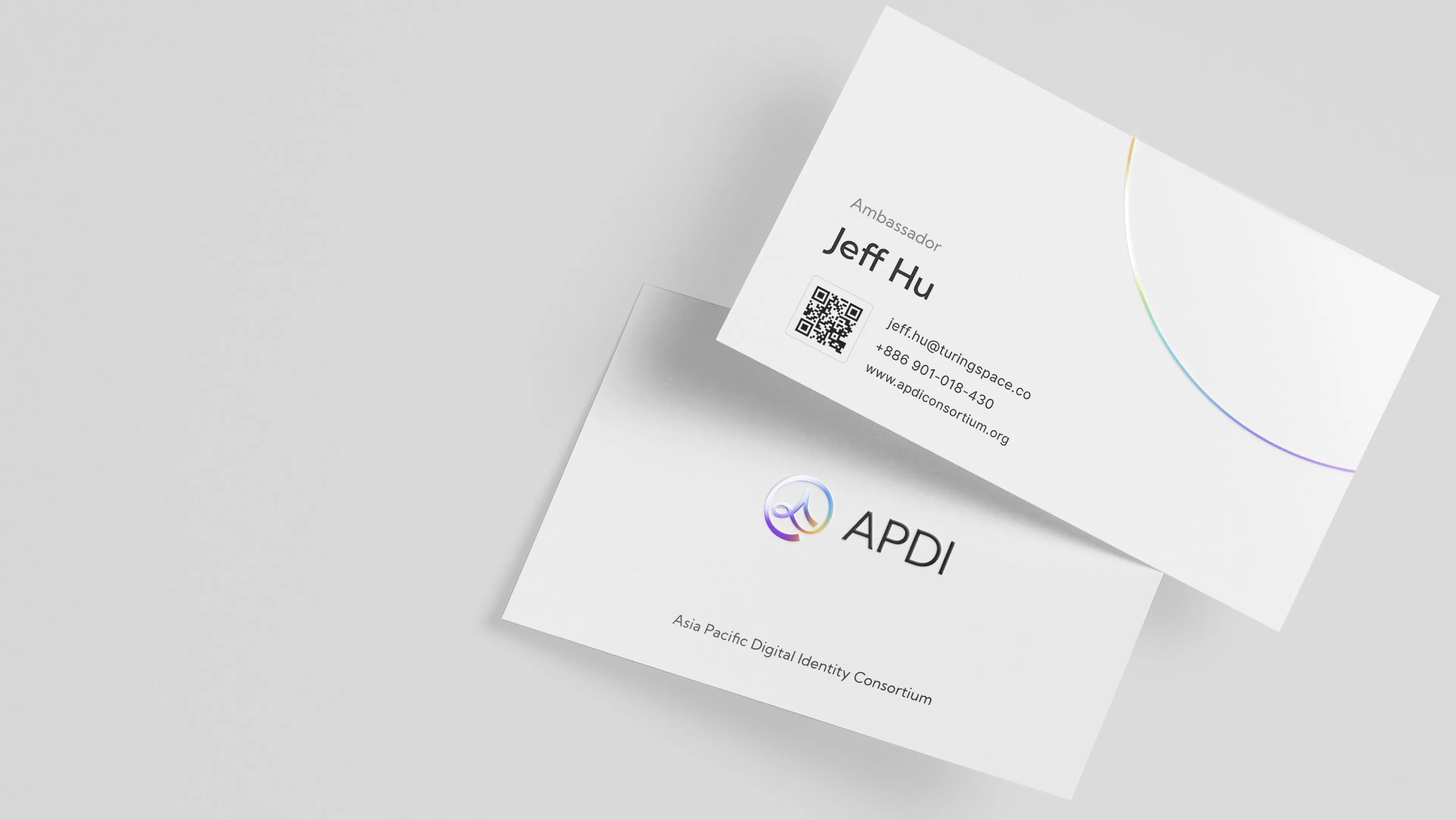
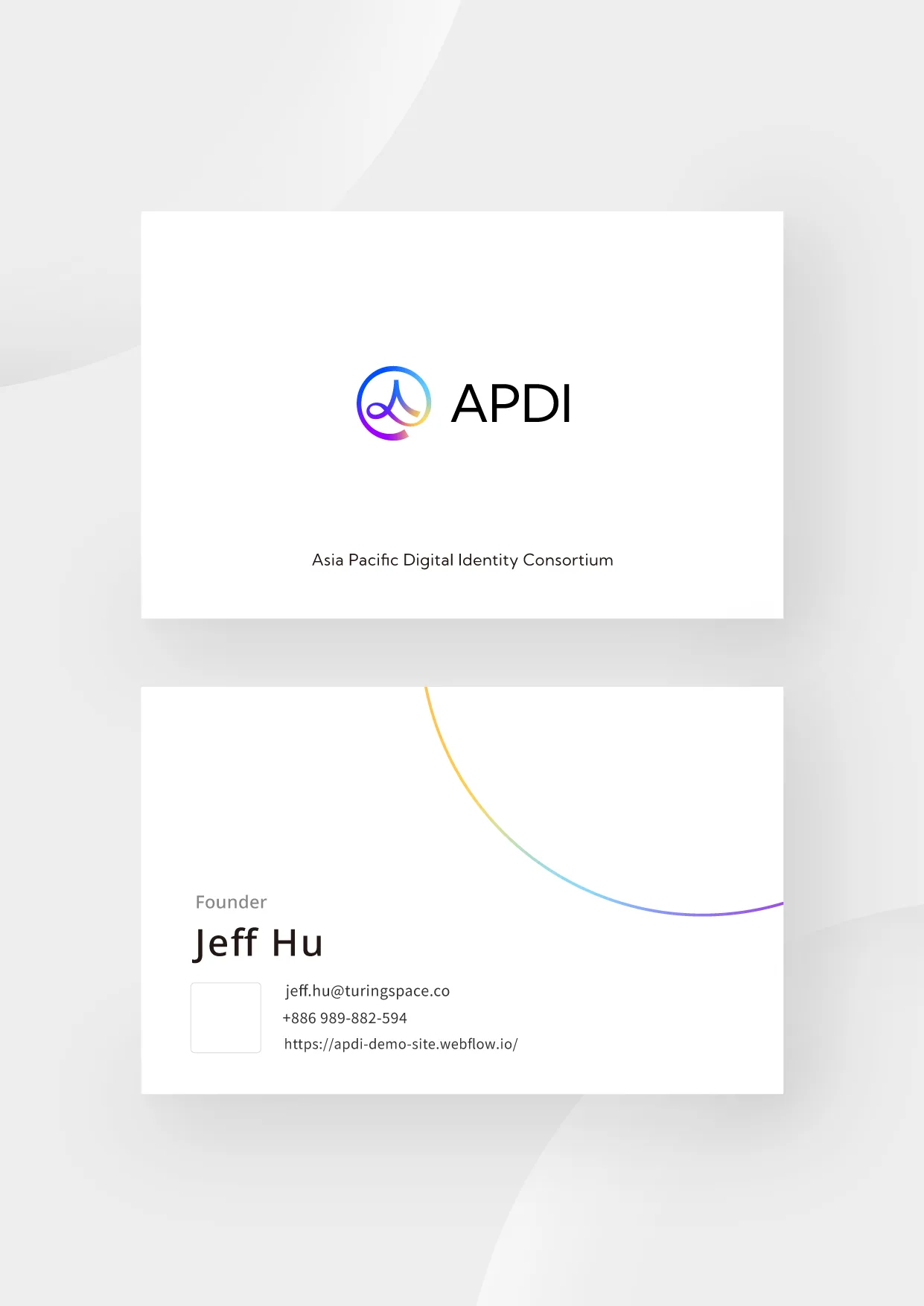
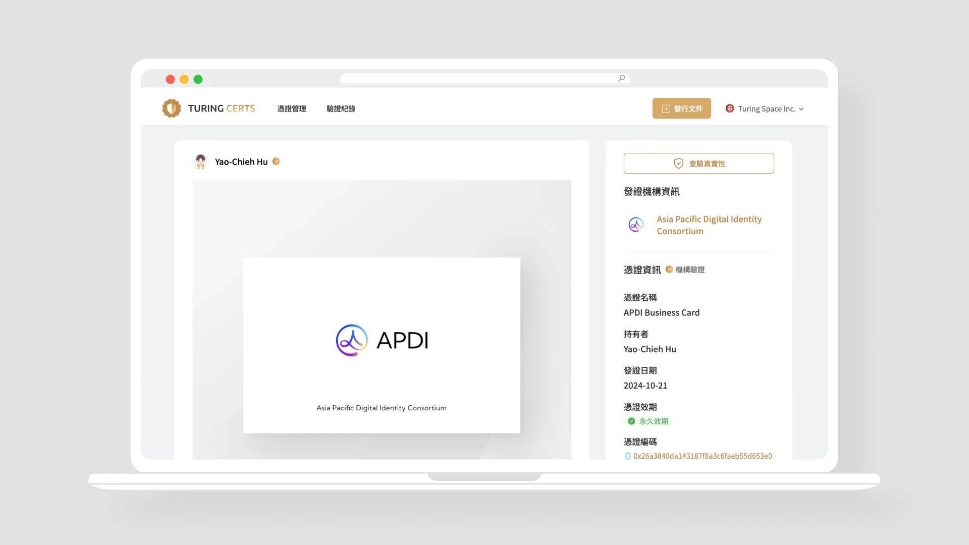
Business Card Design | Physical & Blockchain-Integrated Digital Cards
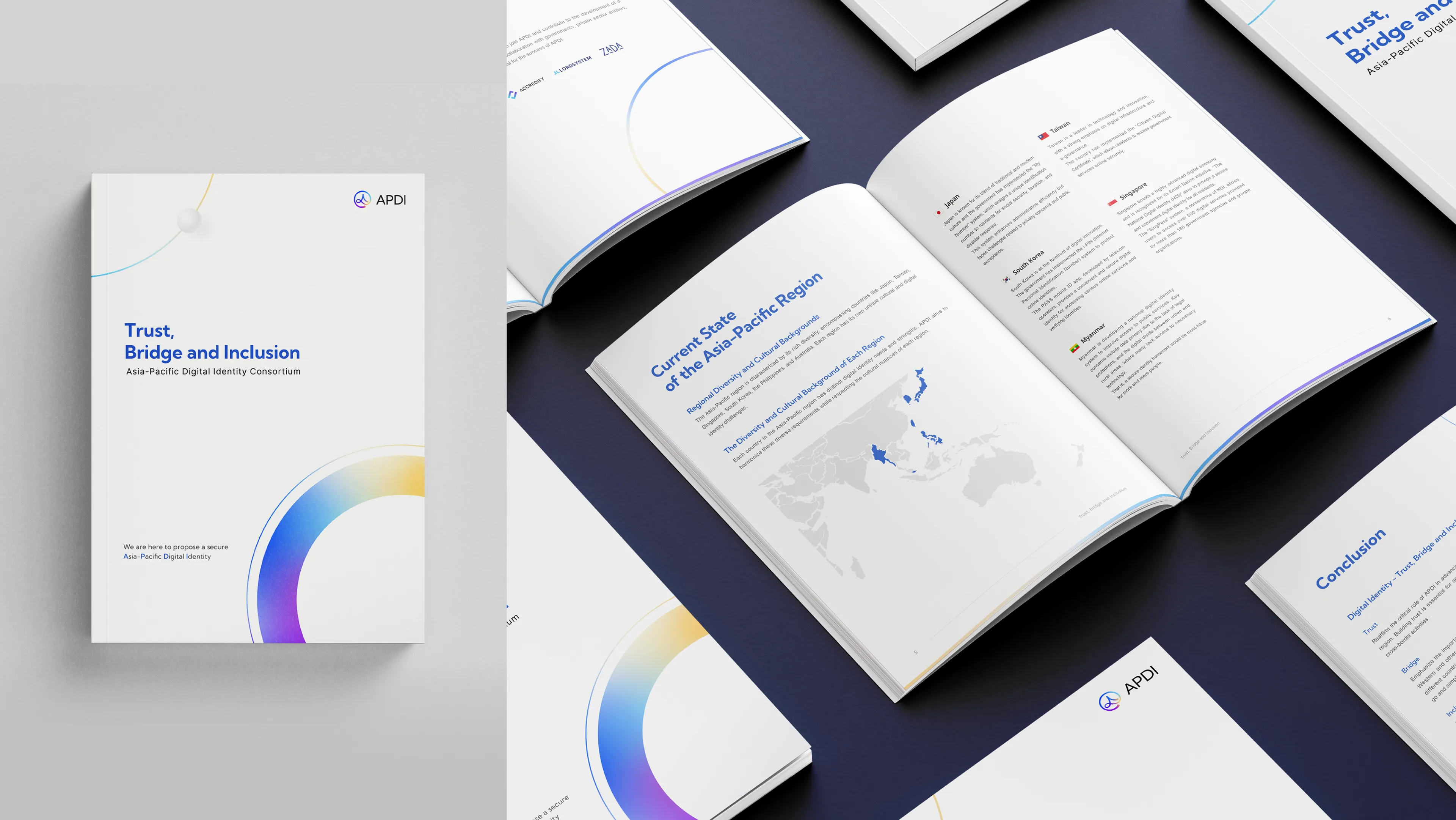
White Paper | Layout & Content Design
Brand Extension | Offline Event Identity
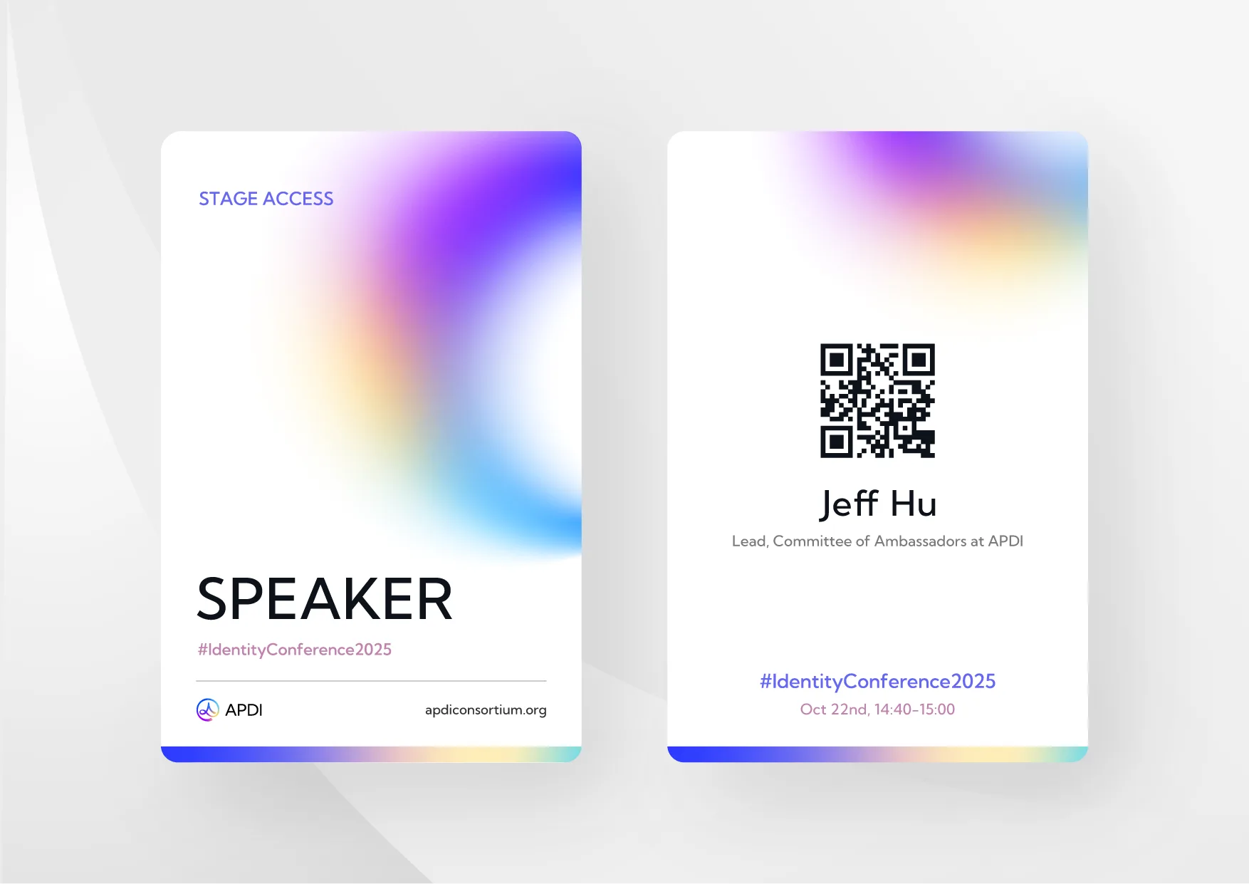
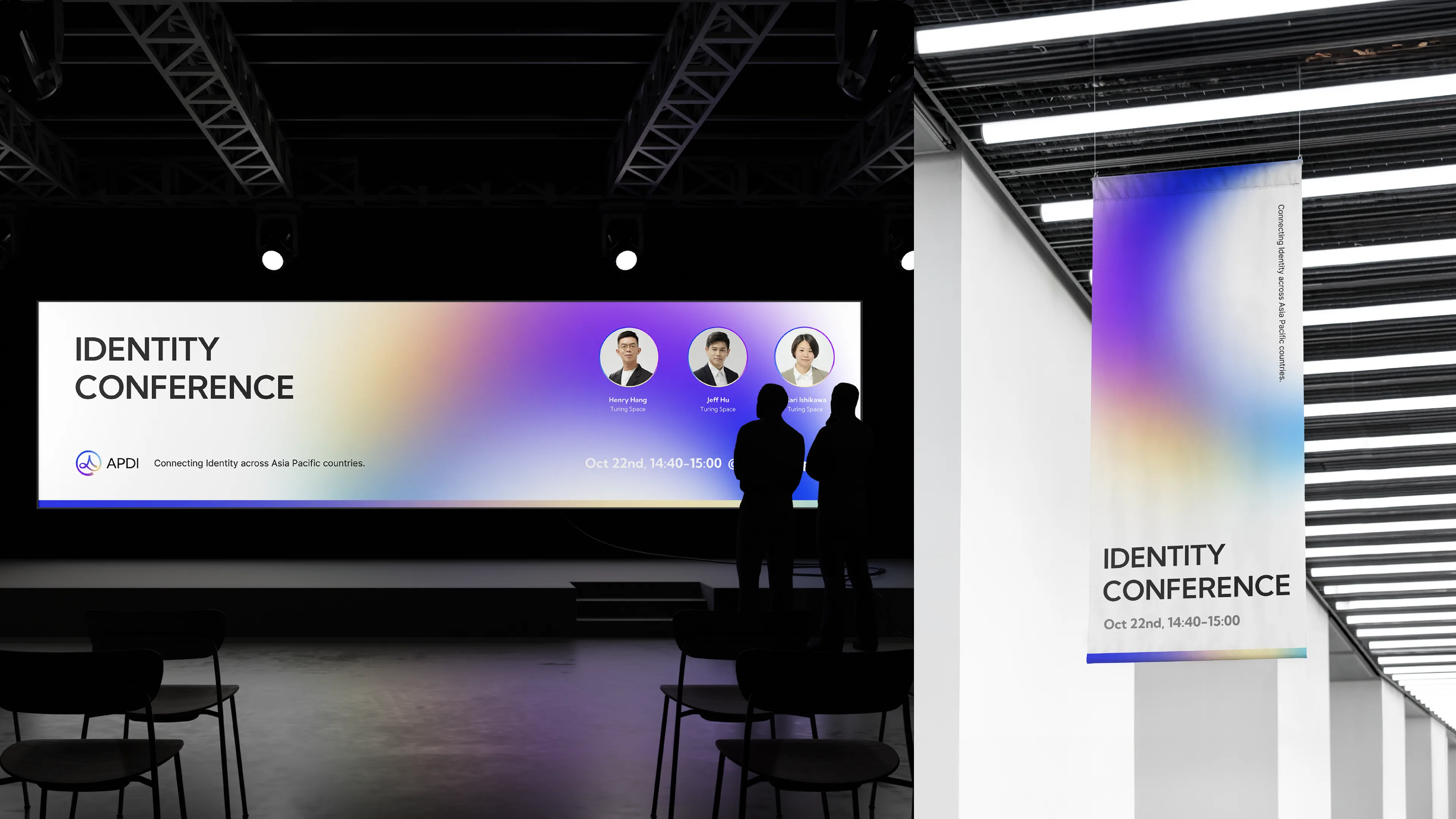
I designed the key visual, event agenda, and attendee badges for an offline forum, seamlessly extending the brand experience from digital to physical.